Streamlining the World of m-Commerce

If you're a retailer and you don't have a mobile website yet, it's time to catch that bandwagon before it's gone. With over one-third of all ecommerce purchases being made on smartphones, mCommerce is verging on being a necessity for future sales. Unfortunately, there are too many instances where mobile shopping is less of a convenience and more of a giant pain in the butt, so it's incredibly important to retain the attention of mobile consumers before they get bored or irritated, if you want to snag those conversions.
It’s possible to create a seamless and pleasant shopping experience. Mobile devices don't have much in the way of screen real estate, so it’s important to keep this limitation in mind when designing instead of ignoring it. The key is reducing any barriers that keep customers from finalizang a purchase. The best way to get that done is to make the mobile shopping experience light and simple. Let your product be the star, and let your content support the product instead of vying for the user's attention.
Read on for tips and tricks to create the most user-friendly mobile shopping experience.
1. Keep it Clean
As with most instances of design, decluttering is the first step. You have limited space with a mobile experience; make sure it is best utilized by including only the necessary and relevant information, focusing on the products. Let the user browse through your inventory freely by getting rid of unnecessary junk like excess navigation, information, or promotions.
2. Utilize Finger-Friendly Design
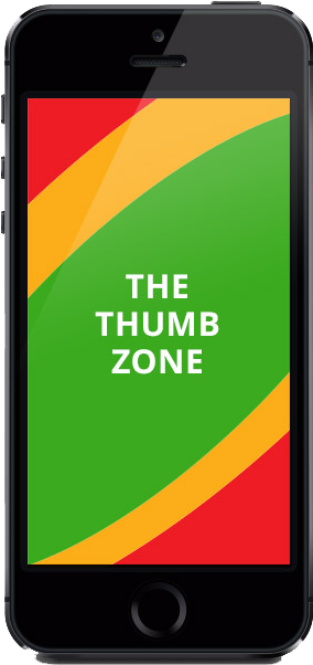
The majority of people, and thus, smartphone users are right handed, and certain areas of the screen are faster and easier to reach using the right thumb than other areas. It's best to make your targets big so they're easier for users to tap. Simplifying navigation in this manner will quell some headaches and keep possible irritated customers who prefer using their devices one-handed from bolting. The image below outlines the easy, medium and harder areas for quick and efficient usability. Any elements that fall outside of what's a natural stretch for the hand are best used for design rather than navigation.

3. Get Them Interested- in 5 Seconds or Less
The "five second test" is a tried and true design assessment that helps you determine the most memorable and visually prominent elements in a landing page. The information people should come away with is:
- Who are you?
- What do you offer?
- Why should visitors care? (What is in it for them?)
If your design is muddled by ads, promotions, excess design elements, etc., it's worth looking into what can be cut out in order to display your company and what you offer in a way that is attractive and memorable to customers.
4. Use High Quality Images
Despite the trend of larger and larger screens in smartphones, those guys are still pretty small. Product photos need to stand out and be seen in detail. If photos are pixelated or tiny, it's sure to agitate people. Show off your product as best you can with large, high-quality photos to ensure the best experience for potential buyers.
5. Simplify Your Product Pages
Trying to squeeze too many product images and descriptions, or showing dozens upon dozens of products on a single very long scrolling page can confuse or slow visitors down, a surefire way to create a mass exodus from your mobile site. Instead of overwhelming people with all your landing space focusing on protracted product info, let customers get to what they want quickly by adding your search bar in the most noticeable area, usually right below your brand. Simplified product information in place of a difficult to read checkout box will inevitably convert to higher sales rates. Don't force your visitors to spend all their energy (and time) swiping, scrolling, and pinch zooming just to see the product and to read your site.
6. Ease of Purchase
When someone makes a decision to make a purchase in your app or mobile website, the last thing anyone wants is a hairy check-out mess. Make sure that the process, from adding an item to the basket, to finalizing orders and confirmation, is a seamless experience that doesn't impede them. Don't force people to sign up for an account, or display tiny buttons, or confuse them with design clutter. At this point they have decided to buy your product! It's important let them do that efficiently by eliminating obstacles and focusing on ease of use instead. An extra tip- make sure your "Buy" button is BIG- avoid confusion and lost sales by making it easier for people to purchase your product.
Good mCommerce solutions can increase conversions and revenue, and embracing the mobile market is more important today than ever. Don't torture your customers with frustrations and confusions as they make decisions about your product. More often than not, it's their user experience that may be the deciding factor when it comes to finalizing a purchase. Stick to clean, clear mobile sites, and you'll be on the right path to future success.
Erin Maloney
